Difference between revisions of "Geopsy: H/V and Spectrum Results"
| Line 77: | Line 77: | ||
<br style="clear: both"/> | <br style="clear: both"/> | ||
| − | + | The curve graph appearance may be [[Geopsy: H/V and Spectrum Toolboxes: Output Tab | customized]]. | |
| Line 128: | Line 128: | ||
For a description of the individual curves see [[#Curve_graph | Curve graph]] | For a description of the individual curves see [[#Curve_graph | Curve graph]] | ||
| + | |||
[[Image:HV_RESULTS_HV_curves.png|thumb|right|300px|Individual H/V curves]] | [[Image:HV_RESULTS_HV_curves.png|thumb|right|300px|Individual H/V curves]] | ||
<br style="clear: both"/> | <br style="clear: both"/> | ||
| + | The curve graph(s) appearance may be [[Geopsy: H/V and Spectrum Toolboxes: Output Tab | customized]]. | ||
| + | |||
== H/V summary == | == H/V summary == | ||
Revision as of 15:19, 12 February 2013
H/V and Spectrum results are the same, except for:
- the labeling of the Y-axis
- the default number of individual curves (1 in the H/V case; 3 in the spectrum case)
The examples shown here below in this are based on H/V results
For the Spectrum results, simply replace H/V by Spectrum when reading the notice.
The results are obtained after adjusting the windowing and processing parameters in the H/V and Spectrum Toolboxes.
Contents
Signal and selected windows
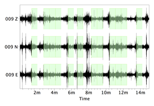
After applying the windowing selection criteria, the selected windows appear in green on the signal sheet.
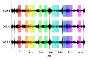
After processing, each selected windows appear with its own color on the signal sheet.
Curve graph
The curve graph shows:
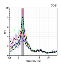
- individual curves from the selected windows, with the color of the corresponding window in the signal sheet (provided All window of the H/V options or Spectrum options in preferences has been selected
- the average curve (black line)
- the amplitude standard deviation curves (dashed lines)
- the peak frequency standard deviation domains (the two vertical gray areas)
The peak frequency is the value at the limit between the two gray areas.
Note: the limit between the two gray areas and the top of the average curve peak are obtained in two different ways:
- the average curve is obtained by averaging all the curves from the individual windows
- the average peak frequency is obtained by averaging the peak frequency of all the curves from the individual windows.
It may thus occur that they do not coincide.
The name of the receiver appears above the top right corner of the curve plot.
Note: the name of the station and the graph are not grouped. Both of them must be selected so as to move the two of them together.
If the item All windows of the H/V options or Spectrum options in preferences has not been selected the color curves do not appear
To get the curve parameters, move the cursor into the graph or into the graph title. A small pale yellow pop-up window appears with:
- the receiver name.
- the peak frequency value with its standard deviation. This value is the limit between the two gray areas, not the value of the average curve peak.
- the peak amplitude with its standard deviation. In case of several peaks, all frequencies and amplitudes are shown.
- the category of the curve, which has been defined by the operator (see next section). This parameter is more useful when several H/V curves are processed.
A bright yellow pop-up window also appears to give the coordinates of the place where the cursor points to.
The curve graph appearance may be customized.
Graph tools
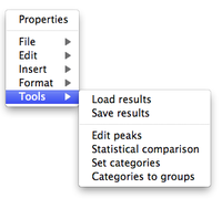
With a right-click outside the graph a pop-up menu appears (this menu is also present at the top of the window when running geopsy under Windows or Linux).
The menu items are described in the figue reference manual, except Tools, a geopsy specific feature described here below.
There are six sub-items in the item Tools:
Load results
Load a curve which results are stored in a .hv file (Example)
Save results
Save the H/V curve in a .hv file (Example)
Edit peaks
The peak is automatically selected as the point with the maximal amplitude encountered along the curve. It may thus not be the real peak of interest. The Edit item allows to change the peak location, to add one or several other peaks, or to remove the peak.
Main article: Edit peaks
The next three sub-items make more sense to be used when computing several curves (see next section):
Statistical comparison
Set categories
Categories to group
Processing several receivers
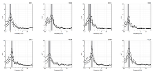
When processing several (at least two) curves, results appear in two windows:
- a window with all individual curves
- a window with a summary
It is possible reprocess some or all receivers.
Individual curves
For a description of the individual curves see Curve graph
The curve graph(s) appearance may be customized.
H/V summary
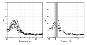
The summary window includes
- two graphs summarizing the curves
- a frequency-distance graph with color-coded amplitude along a profile
- a map showing the distribution of the stations in a geographical system
Note: the two maps appear only when the coordinates of the sites have been entered in the data base
Curves
Two graphs summarizing the individual curves appear at the top of the window:
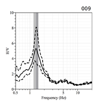
- individual curves all together
- a single curve, the average of all individual curves, with amplitude and frequency standard deviations
Map
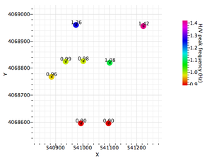
When the receiver coordinates are included in the data base, a geographical map is displayed.
Each location is characterized by three items:
- a symbol at the location of the point
- a color bubble, scaled to the parameter (frequency or amplitude) shown on the map
- a label, which is either the parameter (frequency or amplitude) value, the station name, or which can be omitted
In the default map the receivers are displayed with a frequency color bubble and the receiver name.
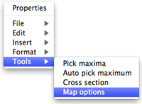
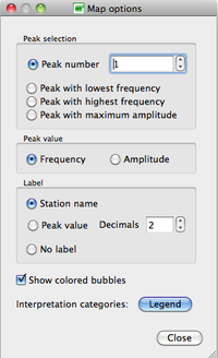
The display parameters may be changed with the pop-up Map options sub-item in the Tools item of the the pop-up menu obtained with a right click outside the map.
The Map options pop-up window presents the optional display parameters.
- Peak Selection
There are four possibilities to select the peak of which the value will be displayed:
- the peak number, according to the peak position along the curve, chosen in the box
- the peak with the lowest frequency
- the peak with the highest frequency
- the peak with the highest amplitude, regardless of its frequency and position in the curve
When all curves present only one peak, and/or no peak, all four options lead to the same display, except a Peak number value greater than 1, in which case no information on the peak values (color nor label) are displayed.
- Peak Value
- Label
Indicates how the receiver locations are labeled:
- Station name: the name used in geopsy for the receiver.
- Peak value: the frequency or amplitude of the peak that have been chosen in the Peak selection section, with the number of decimals set in the Decimals box.
- No label.
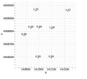
For example, when Frequency in the Peak value section is selected, the peak frequency values replace the receiver name next to the frequency color coded symbol.
- If the Show colored bubbles box is not checked, only the symbols and the label at the receiver locations are shown.
Graph tools when processing several receivers
After selecting one or several curves, with a right-click outside the H/V graph a pop-up menu appears (this menu is also present at the top of the window when running geopsy under Windows or Linux).
The first three items of the menu are described in Graph tools
The next items are useful only when several curves are processed
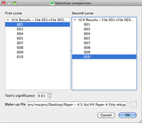
Statistical comparison
After selecting the Statistical comparison tool, a pop-up windows appears, to select the curves to compare.
There is no need to select individual graphs when using this item . All graphs appear in the selection window, whether or not graphs have been selected.
If no or only one graph has been selected, a warning pop-up window appears and the process is abandoned.
